Maci Morris (She/Her)


Posts

Preservation for Video Games

Posted by Maci Morris (She/Her) on

For this semester’s project, I’m tackling piracy as preservation in the video gaming sphere. We’re living through a rapid and all-consuming technological shift from physical media to digital only media. In this project, I would like to analyze the commercial and pirated methods of archive for video games, what this means for consumers and developers of video games, and what alternative methods exists.

Currently, piracy in gaming has offered a means of access and preservation where corporations could not or did not feel compelled to maintain support for older games or make them available through other means. A game’s quarterly or yearly success determines whether future generations would even have the opportunity to experience it, in the process potentially erasing the historical significance of a game or the communities that developed around it.

I’d like to share the landscape for video game archives and preservation with readers and contribute to creating a more informed user base that can get behind methods that of preservation that rooted in more accessibility.

I’m leaning into showcasing this exploration as an interactive, visual essay or a website.


What tools do you think you will need – pain point and choices to make?

I’m thinking to make the visual essay in InDesign or making a website with WordPress/GitHub Pages, or a GitBook.

Tools – I’ll be using notion and google doc/word doc for drafting and writing, Adobe tools for image creation or editing.

Pain Points

  • Narrowing down an audience. On one hand, it’s to the DH community, but I think this is also valuable to folks who enjoy games and preservation, so a greater movement can emerge to support sustainable methods for preserving video games.
  • How to make this a visually interesting project. I don’t love the idea of a full website since long term hosting ect. In the spirit of making this more publicly engaging, it needs good visual intrigue. On the fence on how well I can do this with a visual essay when the more public audience is probably easier to reach through video, audio, and yeah, an actual game.

What is the final deliverable?

An engaging visual essay that blends analysis and narrative storytelling with multimedia (photos, videos, etc). Also taking inspiration from publications like The Pudding, or other digital magazine/ zine-like creations.
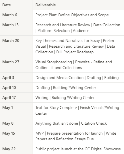
Timeline

Project timeline
Posts

DH Project Study – Moment of Innovation

Posted by Maci Morris (She/Her) on

https://momentsofinnovation.mit.edu

Overview

This is a website that documents the intersections of representation and technology as An interactive installation and online research project. It chronicles innovative technologies or creative applications of technologies used in documentary work through the years. The project’s goal is to link the technological past to the present. It is a joint project from MIT’s Open Documentary Lab and IDFA DocLab.

Based on the credits page it was created by a mid-size team of under 20 folks. They worked with a France-based media studio that works with orgs and companies to develop websites, interfaces, and films. They did have outside funding from several foundations.

Works for me:

  • that it scales well for multiple sizes across desktop and is optimized for mobile viewing
  • the typeface and font are easily readable. san-serif typefaces for reading on the web is better
  • landing page is visually interesting, not overwhelming. I like the use of mouse hover effects to give the website the feeling of movement. It’s clear what users can do on the site.
  • Most links led somewhere.
  • The design is simple, but solid (kind of standard internet site, but feels more modern that many DH projects I’ve seen)
  • The innovations documented were fascinating and engaging. I watch documentaries and encounter documentation practices everyday but had not really taken a more conscious moment to think about the evolution of this practice over time. (one of those you know on a high level but don’t investigate more thoroughly often)
  • I like that each section starts at the point furthest from the present. Each section is a visual timeline of documenting practices and you can slide show through each one without going back to the main page. This feature is only possible at the top of a given sections and I wonder why they chose not to include a button or arrow a prompt for the next section at the end of a section too since it is less intuitive to scroll back up to the top.
  • The description for each project is not super text heavy and give you enough information to do your own deeper dive.
  • The site also doesn’t have the text spanning the entire page, which will fatigue readers, so column sizes are good.
  • This feature is only possible at the top of a given sections and I think I may have tried to see if a prompt for the next section could be added to the end of a section since it is less intuitive to scroll back up to the top.

Some Issues:

  • There’s a favoring of projects from MIT of IDFA works, or other orgs in these networks which makes sense as they could more easily get information about these works. But regardless there seems to be an overrepresentation or bias in that way
  • There’s a gap in years represented. This could give the wrong impression to a user that innovation isn’t happening during these times.
  • Overall the content is Western centric and also the projects included are overwhelming male led projects
  • I don’t know as much about web accessibility features, but there don’t seem to be any options as far as I could tell.
  • A huge issue is that this type of project includes links to other projects. While not every innovation links to a project somewhere else on the web, many of them do. As long as the moments in innovation team is updating and maintaining the site it’s fine, but they can’t account for how well or not other sites they have linked to keep up their web presence. A few links I clinked into had expired domains, domains taken over by AI sites, outdated flash reliance, broken video links etc.
  • They do make clear they are not exhaustive list and I’m not sure if it’s still being updated, but most documentation stops around 2015/6

Overall I do find this to be a successful DH project, but bias and typical web age issue are issues here.

Skip to toolbar